

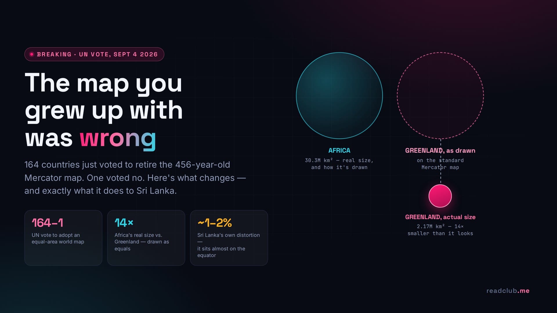
On Friday, September 4, 2026, the United Nations General Assembly voted 164 to 1 to formally encourage the world to stop using the map projection you almost certainly grew up with. One country voted no. Six abstained. Everyone else — 164 member states, including the entire African Union bloc that pushed the resolution and France, which co-sponsored it — voted to retire the Mercator map as the default picture of the world, in favour of a projection that finally gets the sizes right.
If that sentence sounds too strange to be true, that's the point. A map is the one document almost nobody fact-checks. You have seen the Mercator world map on a classroom wall, an airline seat-back screen, a weather forecast, the opening credits of a dozen films, and the "world" emoji on your phone. It has quietly told you, your teachers, and your teachers' teachers, that Greenland is roughly the same size as Africa. It is not. Africa is about fourteen times larger. You have been looking at a lie for 456 years, and until this week, almost nobody voted on whether to keep believing it.
Here is what actually happened at the UN, why the map you know is wrong in a very specific and measurable way, what replaces it, and — because this is a Sri Lankan question as much as a global one — exactly what the new map does, and does not, change about how Sri Lanka appears on the page.
What the UN actually voted on
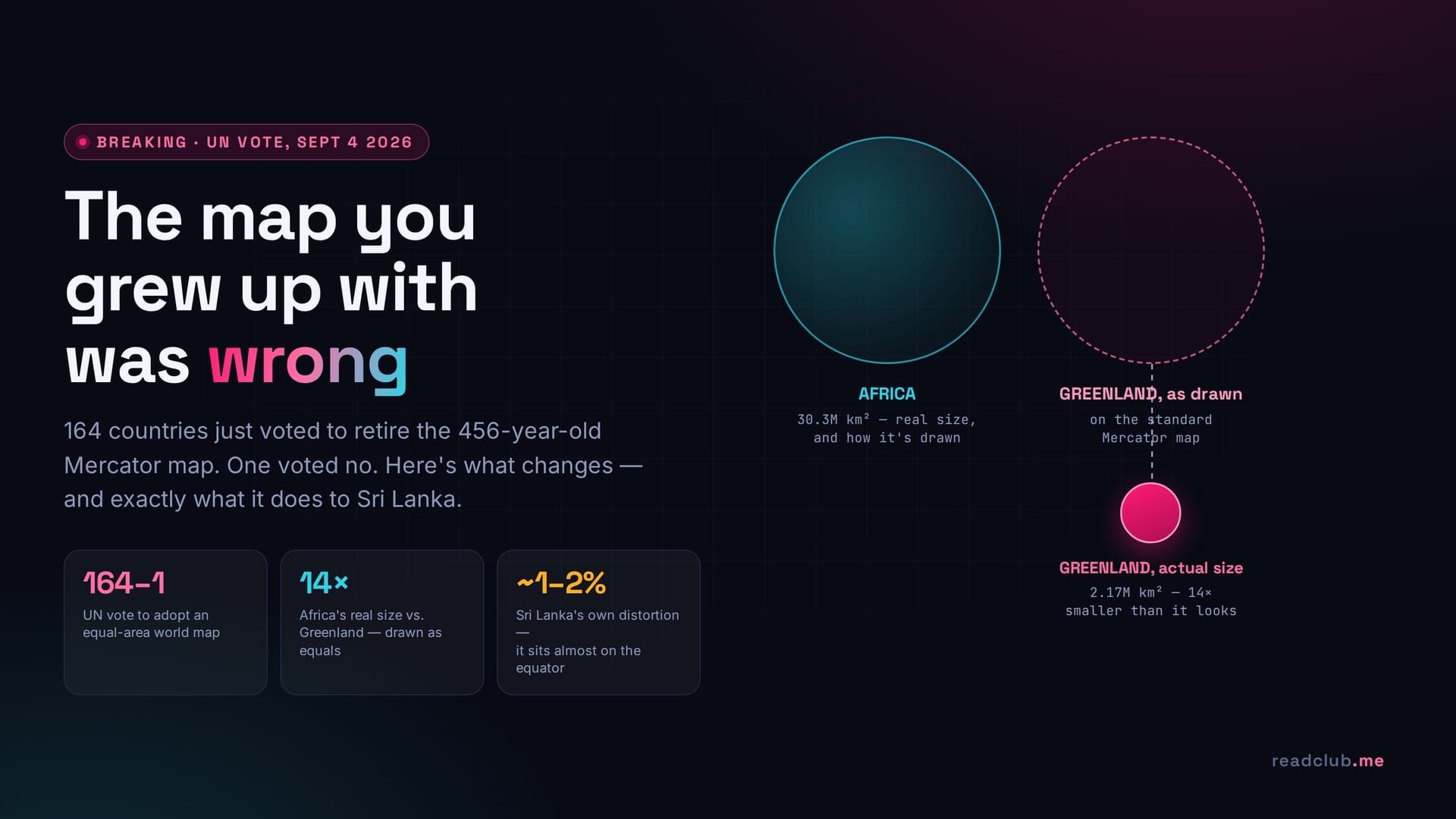
The resolution, informally known as "Correct the Map," was introduced by Togo on behalf of the African Group and backed by the African Union, with France as co-sponsor. It passed 164 in favour, 1 against, 6 abstentions. The lone vote against came from the United States; its deputy representative dismissed the effort as ideological, calling such resolutions "barnacles" on the UN's real work.
Togo's Foreign Minister, Robert Dussey, put the case for it plainly: "Maps shape our understanding of the world. They guide education, nourish imagination." The executive director of Africa No Filter, one of the advocacy groups behind the campaign, framed it more bluntly: "If we got something as basic as Africa's size wrong for this long, what else about Africa have we simply accepted without questioning?"
Two things are easy to misread in the coverage, so it's worth being precise about both. First, the resolution is non-binding — it does not ban the Mercator projection or force any government to redraw its textbooks by a deadline. It encourages UN bodies, member governments, and educational institutions to adopt an equal-area alternative. Second, the replacement isn't the 1973 Gall-Peters map that Boston Public Schools switched to back in 2017 in an earlier, smaller version of this same argument. The projection named in the resolution is the Equal Earth projection, published in 2018 by cartographer Tom Patterson and colleagues specifically to fix the sizes without making the shapes look as stretched and unfamiliar as Gall-Peters does.
The map you grew up with was never trying to show you size
None of this makes Gerardus Mercator a villain. He drew his projection in 1569 for one job: helping sailors draw a straight compass line between two points on a curved planet and not die doing it. To make that math work, a Mercator map has to stretch east-west distance more and more the further you get from the equator — and to keep the shapes from warping, it stretches north-south by the same amount. The result is a projection that preserves angles and local shape beautifully, which is exactly what navigators needed, and inflates area catastrophically, which is exactly what nobody needed once the map moved from a ship's chart table to a classroom wall.
The distortion follows a simple rule: it grows with the square of the secant of your latitude. In plain terms, the further a place sits from the equator, the more its true area gets exaggerated on the page — and because it's a squared relationship, the effect accelerates fast as you move poleward.
The two figures cartographers reach for most:
- Greenland vs. Africa. On a standard Mercator map, Greenland looks roughly the same size as the African continent. In reality, Africa's land area is about 30.3 million km² against Greenland's 2.17 million km² — Africa is roughly 14 times larger, not the same size.
- Canada and Russia vs. everyone near the equator. Together, Canada and Russia visually occupy roughly a quarter of the map's surface area. Their actual combined share of the planet's land is closer to a twentieth of it — a fivefold visual exaggeration.
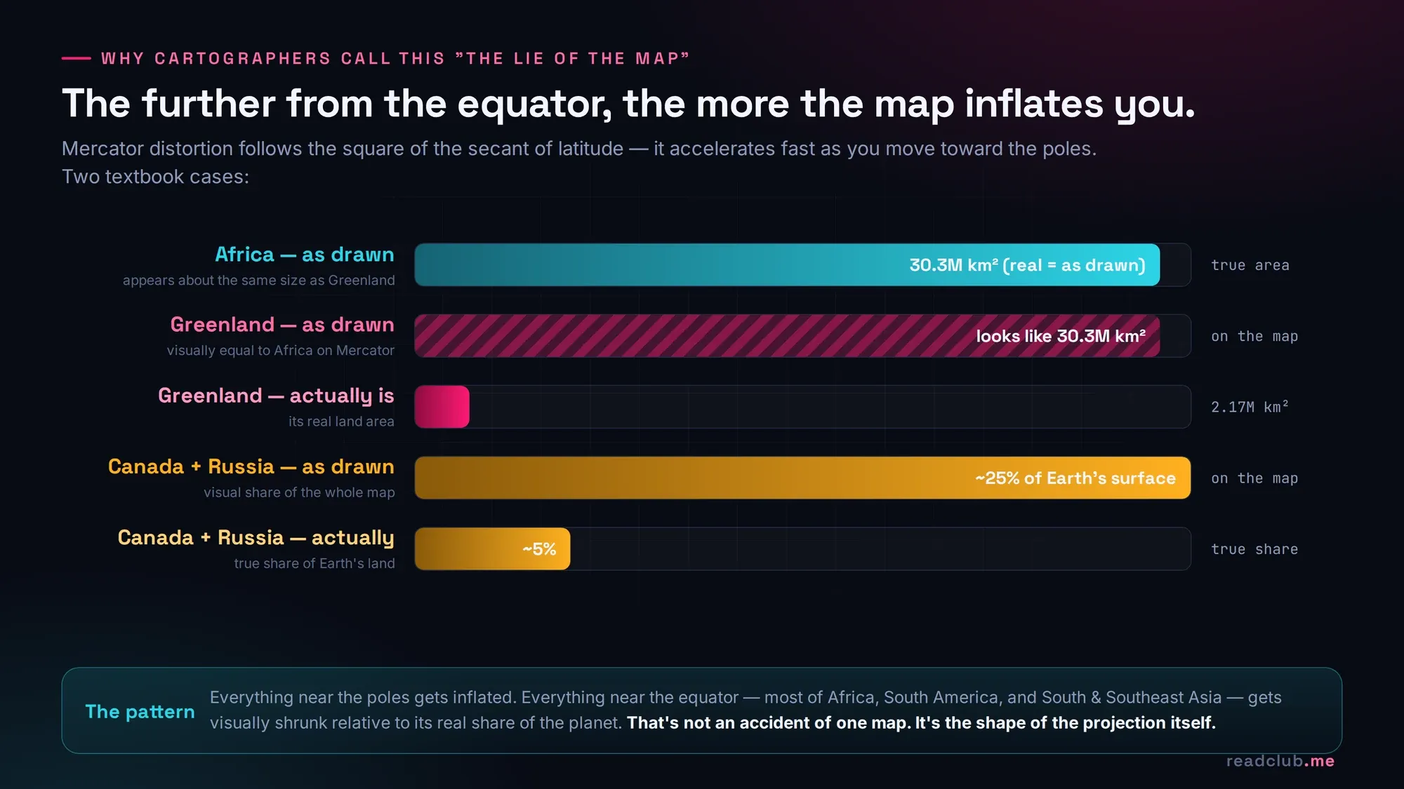
Put those two together and the pattern is obvious: every country close to the poles gets inflated, and every country close to the equator — including almost the entire African continent, most of South America, and South and Southeast Asia — gets visually shrunk relative to its real share of the Earth. That is not a rounding error. It is a five-century-old habit of making the Global North look bigger and the Global South look smaller, on a document billions of people accept without ever being told it's doing that.
So what replaces it, and what does it actually fix
The Equal Earth projection is what's called an equal-area projection: every region on the map takes up screen space in true proportion to its real share of the planet's surface. Greenland shrinks down to its correct, modest size. Africa, India, and Indonesia grow to fill the space their populations and landmass actually occupy. The trade-off — there's always a trade-off in flattening a sphere — is that shapes near the poles bend slightly more than they do on Mercator. Patterson's team designed Equal Earth specifically to keep that shape distortion gentle and visually pleasant, which is why it was chosen over the more aggressively equal-area, more visibly stretched Gall-Peters map that had been the reformers' go-to alternative since the 1970s.
You may have already met a version of this fix without noticing. Since 2018, Google Maps stops using the flat Mercator layout once you zoom out far enough and switches you to a rotating 3D globe instead — Google's own quiet admission that a flat Mercator view at world scale gives people the wrong idea about how big things are.
Now the part that matters if you're reading this from Colombo, Kandy, or Jaffna: what changes for Sri Lanka
Here is the genuinely counterintuitive fact in this entire story. Sri Lanka sits between roughly 5°55′N and 9°50′N latitude — a sliver of the map almost sitting on the equator. Plug that into the same distortion formula that inflates Russia and Canada, and the exaggeration factor at Sri Lanka's latitude works out to barely 1–2%. In other words: Mercator has been telling the truth about Sri Lanka's size and shape almost this entire time. The country that looks like an unassuming teardrop off India's southern tip on every classroom map you've ever seen has actually been drawn close to honestly. The lie was never really about Sri Lanka — it was about everything far to its north.
That doesn't mean the map has been fair to Sri Lanka. It's been accurate about its size while being wildly inaccurate about everyone it gets compared against, and that gap is where the real distortion hides. A few honest numbers, all drawn from actual land-area data rather than map pixels:
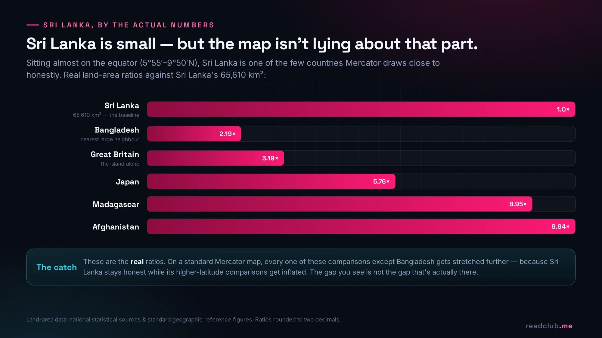
- Sri Lanka's land area is 65,610 km².
- The island of Great Britain is about 3.19 times larger — a real, measurable difference.
- Madagascar is about 8.95 times larger; Afghanistan about 9.94 times larger; Japan about 5.76 times larger; Bangladesh, Sri Lanka's nearer neighbour, is about 2.19 times larger.
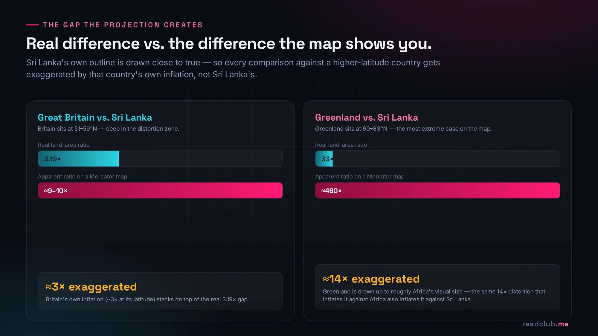
Those are the real ratios. Here's what Mercator does to them. Great Britain sits at roughly 51–59°N, deep enough into the distortion zone that its area is inflated on the page by a factor of about three, on top of its real size advantage. Run the arithmetic through and Great Britain doesn't look 3.19 times bigger than Sri Lanka on a standard world map — it looks closer to nine or ten times bigger, because Sri Lanka's honest portrayal is being compared against Britain's inflated one. The real gap between the two countries is exaggerated roughly threefold, purely by where each one happens to sit on the latitude line — nothing to do with actual land.
Push the same logic to its most extreme case and the numbers get almost absurd. Greenland's real area is about 33 times Sri Lanka's — already a big gap. But because Mercator visually inflates Greenland up to roughly the size of Africa (30.3 million km²) while drawing Sri Lanka close to true, the two countries end up looking roughly 460 times apart on the page, not 33 times. Sri Lanka isn't shrunk by the projection. Its neighbours on the map — everyone sitting up near Greenland's latitude — are inflated so far past reality that the gap itself becomes a kind of optical illusion.
That's the fact worth remembering out of all of this: the Mercator map was never lying about Sri Lanka. It was lying about the scale of everything Sri Lanka gets silently measured against — every time someone glances at a world map and files away an impression of "how big" a country is relative to the island nation next to India. Switch to Equal Earth and Sri Lanka's own outline barely moves. What moves is everything around it, snapping back down to a size that finally matches reality.
A quick timeline, because this argument is older than this week's headline
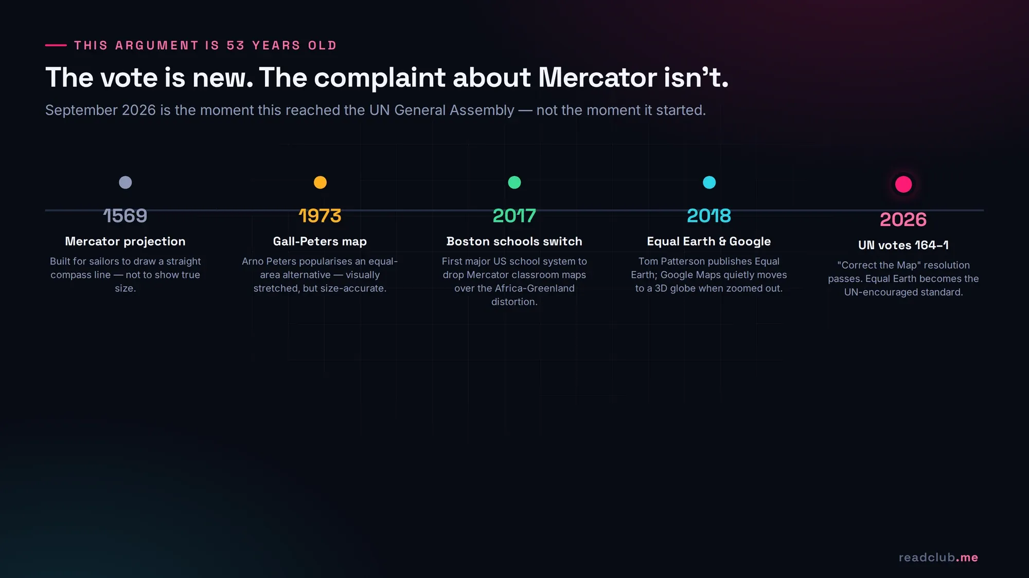
This didn't start with a UN vote. Cartographers have been sounding this alarm since German historian Arno Peters popularised an equal-area alternative in 1973 — a map so aggressively stretched at the poles that it became its own kind of controversial. Boston Public Schools made global news in 2017 when they became the first major US school system to switch their classroom maps to Gall-Peters specifically because of the Africa-Greenland distortion. Tom Patterson's 2018 Equal Earth projection was built as the more visually palatable fix that could actually win over cartographers who'd resisted Gall-Peters on aesthetic grounds. And Google quietly moved its own zoomed-out globe view away from flat Mercator that same year. September 2026 is the moment this argument finally reached a vote in the room where 193 countries sit — not the moment it began.
Why a map argument is actually worth your attention
It's tempting to file this under harmless trivia — a cartography curiosity for a slow news week. It isn't, and the UN vote is really an argument about something bigger than ink on paper: what gets treated as big, important, and central in a world where most people's mental model of "the globe" comes from a single, uncorrected image they saw once in a geography classroom and never questioned again. A continent that looks smaller than it is gets talked about as if it matters less than it does — in trade negotiations, in aid framing, in how foreign news gets covered, in which countries show up first when someone zooms out on a map app. Fixing the picture doesn't fix any of that on its own. But you can't fix a distortion you don't know you're looking at, and for 456 years, most of the world didn't know.
If you want to see the actual gap for yourself rather than take any article's word for it — including this one — the interactive tool thetruesize.com lets you drag any country's true outline across the map and watch it shrink or balloon as it crosses latitude lines. Drag Sri Lanka up toward Greenland and watch how little it changes. Drag Greenland down toward the equator and watch it deflate to a fraction of the space it "occupies" on every wall map you've ever squinted at.
The bottom line
A 456-year-old navigation tool became the accidental default picture of the planet, and it has been quietly overstating the size of everywhere far from the equator while getting the equator itself mostly right. On September 4, 2026, 164 countries voted to start correcting that — not by banning the old map, but by asking the world to stop treating it as neutral. Sri Lanka, sitting almost exactly where the distortion goes to zero, was never the victim of this particular lie. But understanding why it wasn't is the fastest way to see, precisely, who was.
Frequently asked questions
Did the UN ban the Mercator map?
No. The September 4, 2026 resolution passed 164–1 with 6 abstentions, but it is non-binding. It encourages governments, UN bodies, and schools to adopt an equal-area alternative; it does not require anyone to stop using Mercator maps.
What map projection is replacing Mercator?
The resolution points toward the Equal Earth projection, created in 2018 by cartographer Tom Patterson and colleagues. It is an equal-area projection, meaning every region occupies map space in true proportion to its real land area, unlike Mercator.
Is Equal Earth the same as the Gall-Peters map?
No, though both are equal-area projections. Gall-Peters (1973) is more aggressive about preserving area at the cost of visibly stretched shapes, especially near the poles. Equal Earth was designed specifically to fix Mercator's size distortion while keeping shapes closer to what people find visually familiar.
Why does Greenland look the same size as Africa on most maps?
Because the Mercator projection inflates area more and more the further a location sits from the equator, following a square-of-secant-of-latitude relationship. Africa's real land area (about 30.3 million km²) is roughly 14 times Greenland's (about 2.17 million km²), but both occupy similar space on a standard Mercator map.
Does the new map change how big Sri Lanka looks?
Barely. Sri Lanka sits almost on the equator, between roughly 5°55′N and 9°50′N, which is close to the zero-distortion line on a Mercator map. Its size and shape have been drawn close to accurately all along. What changes under Equal Earth is everything Sri Lanka gets compared to — high-latitude countries like Britain, Russia, and Canada shrink down to their true size, closing an apparent gap that was never really that wide.
Which country voted against the resolution?
The United States cast the sole vote against the "Correct the Map" resolution. Its deputy UN representative characterised the effort as ideological.
Sources
- Al Jazeera — UN votes to adopt new world map that reflects Africa's true size
- NPR — The U.N. backs a new world map showing Africa in its true relative size
- Visual Capitalist — Mercator Misconceptions: Clever Map Shows the True Size of Countries
- Brilliant Maps — Mercator Vs The True Size of Each Country
- The True Size Of — interactive country-size comparison tool
- ScienceAlert — Boston Public Schools ditch the Mercator map (2017)
- TechCrunch — Google Maps is no longer #flatearth (2018)
- Wikipedia — Mercator projection


